The BoB spread is a type of yield curve spread, it depicts a spread between the very longest maturity treasuries, the 30-year Bond and the 30-year Ultra Bond. So, what’s the difference, and why is this such a good trading vehicle?
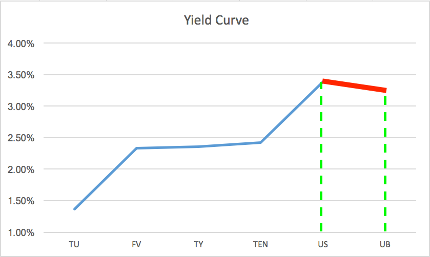
Here’s the part of the yield curve that the BoB spread represents, indicated by the segment in red. It is very unusual for this segment to be pointing down, while the rest of the yield curve is pointing up.
The BoB spread represents the delivery of the longest maturity treasury products. But wait, they are both 30 year bonds, right?
Yes, it is true, they are both 30 year bonds, but the treasuries they can potentially deliver upon expiration when the contracts expire is very different. What you probably don’t realize is that when a Bond futures contract expires, you don’t get a pristine Treasury with a full 30 years left until maturity, what you do get is a possible range of previously issued 30-year bonds that could have a wide range of time left until they mature.
30-year Bonds deliver a product with between 15 and 25 years left until maturity, while 30-year Ultra Bonds deliver between 25 and 30 years left until maturity. Because the Ultra is further out there, the face value is generally priced a bit higher than the regular 30-year bond. Also it’s price is a bit more volatile.
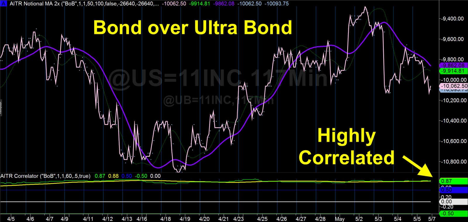
Highly Correlated
The good news for traders is that because they represent essentially the same thing, just different groupings of the same thing, so they are highly correlated, and as such make excellent spread trading partners. The correlation between these two products generally hovers in the high 80s and low 90s on the correlation coefficient scale.
Excellent Movement Tied to Global Macro Events
The BoB spread is an excellent barometer of where the economy may be heading. It is often used as a leading indicator for the shorter maturity Treasury products. In fact, right at this moment, it appears that long bonds are predicting a flattening of the yield curve, with a rather significant divergence over the past week or so.
You can see this very clearly on the yield curve chart at the top of this post, as well as the change in the moving average in the notional chart just above.This is the Bond market saying they expect some sort of change in global events that will affect things well into the future for the worse, perhaps this is a prediction of the French election.
Bonds Lead All Markets
There’s a reason it is often said that the smartest traders on the planet are the bond traders, and that’s because they are also tuned into all the big global macro events around the world. So, if you like trading in the big picture, there’s no bigger way to trade than with Treasuries and the yield curve.
